Planning Blog: Title Design
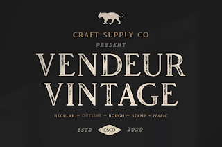
Welcome back guys, I'll be putting my title design in real life today. I'm thrilled because ever since the project started, I've been considering possible titles for my pieces. Though I had a lot of ideas, this was the final and best one. In order to make the title fit with the video and the murder mystery's overarching concept, I decided to go with a vintage, rustic feel. Essentially, I still want my titles to look like the one that is displayed in the photo below.
The majority of the titles will be included into the background image. Also, the background image will zoom to a certain spot before displaying the title. For example, a title will appear in one of the scenes with the investigation boards.
My project's working title right now is "Chasing Shadows," and I think it relates to the video.
Depending on the background, the titles' font will be medium-large black, beige, or white, and they will adhere to standard sentence form, but the 1st letter of each word will be capitalized. For example: Casting Director: Hansen Durand
The titles will appear for two to three seconds before disappearing.
Stay tuned for my next blog where I’ll unravel even more mysteries about making an opening scenes video. Trust me; you won't want to miss it.


Comments
Post a Comment